This week, I drew 16 logo designs for the Avozilla then chose three out of the sixteen to finalize.


Design 3 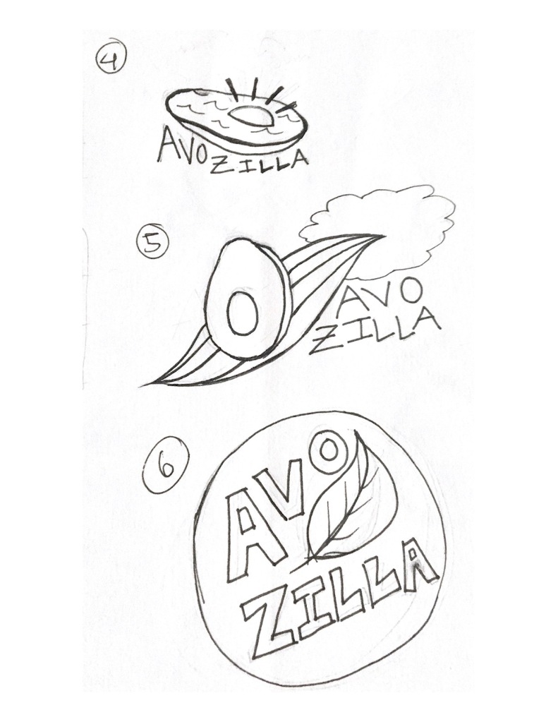


3 Final Designs
For the final designs, I chose the designs that addressed the size of the Avozilla being a lot larger than the average avocado since that is the main selling point or point of difference. Although I was fond of some of the other choices, choosing them would’ve just been choosing a logo for a regular avocado.
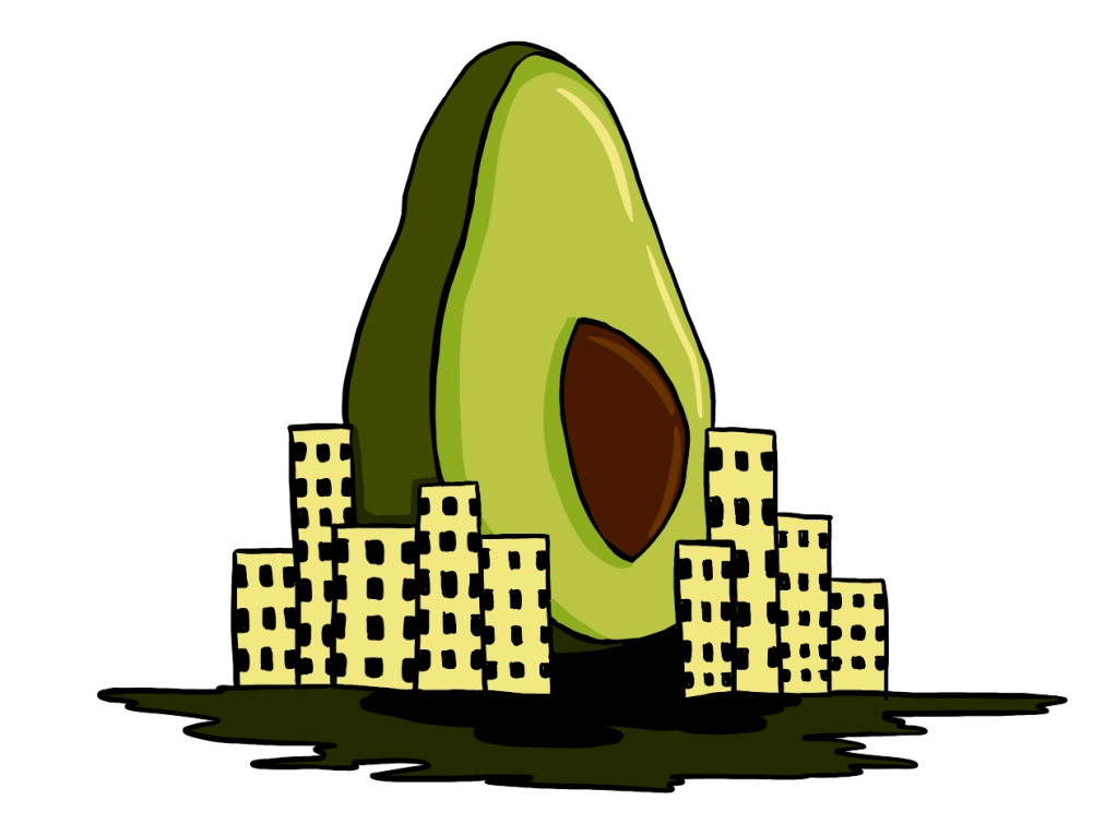
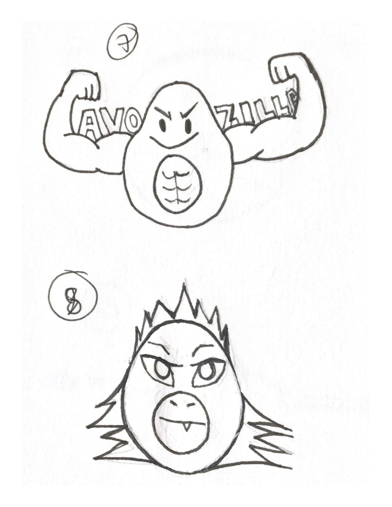
The ‘Godzilla’ character is known to be large enough to tower over tall buildings which is the basis of this logo design.

The muscles aim to emphasize on the idea that the Avozilla is much bigger and tastier than a regular avocado.

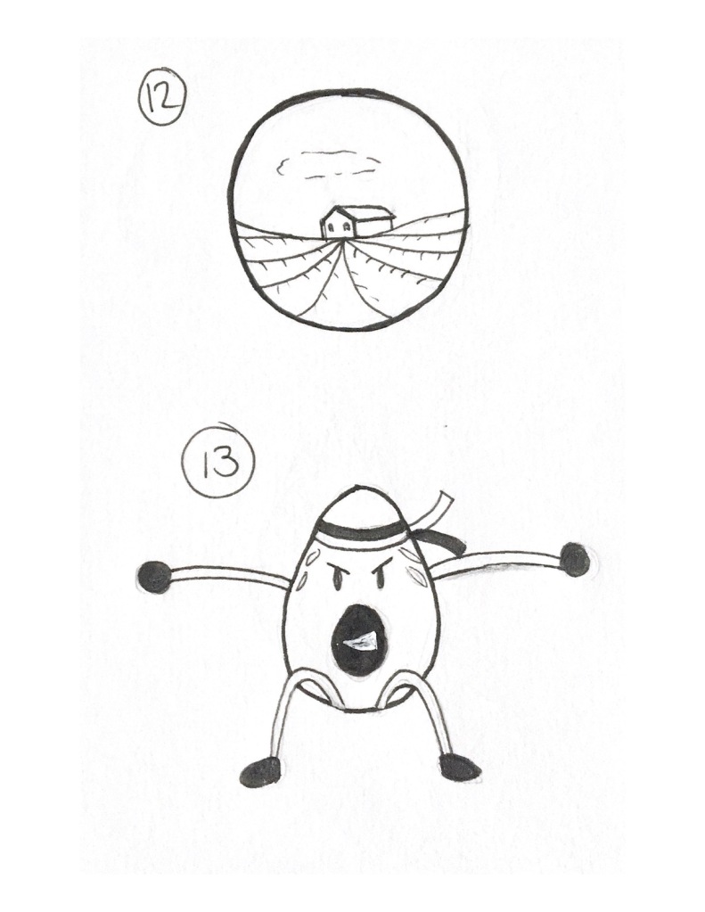
This design depicts the Avozilla as a planet with a ring and stars surrounding it. It has a much friendlier design than the other ones for a different kind of approach.
